UI / UX PROJECT  2026

2026 Design System

Rebuilding my own passion project with the modern Figma toolkit including variables, auto layout, and a real component library to show how I'd approach it now.

“Explain that gap in your portfolio.” Well, for five years I worked at an agency, juggling 100+ client businesses with an international team at all hours while under NDAs. I wanted a personal project to channel everything I'd learned and Dice Goblin, built by hand back in 2021, was the perfect thing to rebuild the right way. It was also a bit cathartic.

{{ m.icon }}
{{ m.label }}
{{ m.value }}
The System At A Glance
{{ g.num }}
{{ g.label }}
{{ g.note }}
Total build time
versus about a month when done by hand in 2021
13hrs
{{ iconSpark }} Five Years Later

Same project, with the tools it always deserved.

The 2021 build placed every screen, color, and spacing decision by hand. This time I leaned on everything Figma has shipped since then and the experience I gained running real systems at scale. The result is faster to build, far easier to maintain, and ready for both desktop and mobile.

{{ t.icon }} {{ t.name }}
{{ t.note }}
02
Foundations

It starts with a full color palette.

Before a single component, I built the raw material: complete tonal ramps for the brand teal and amber, a warm neutral scale, and dedicated status hues. Ten stops each, so every later decision has a value to reach for.

03
Architecture

A three-tier variable system.

The palette feeds a layered structure: raw Brand values, semantic Alias scales, and final Mapped use cases. Each tier only ever references the one below it.

That indirection buys three things at once: control at the source, consistency across the system, and the flexibility to re-theme everything from a handful of values.
{{ tier.name }}
{{ tier.desc }}
{{ tier.token }}
{{ iconLink }} Change Brand/Primary/500 once and every action button, link, and focus ring updates across the entire system.
Mapped · Use Cases
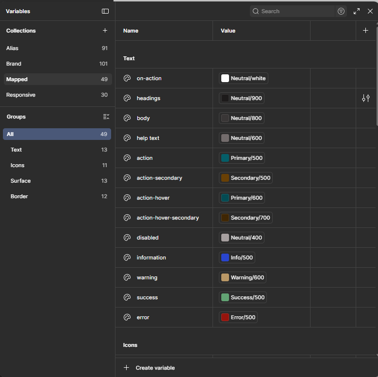
Figma Mapped variable collection: Text-group tokens including on-action, headings, body, help text, action, action-secondary, action-hover, disabled, information, warning, success and error, each pointing to an Alias value
A slice of the Text group: 49 mapped tokens span Text, Icons, Surface, and Border, each resolving down to an Alias value.
Responsive · Typography
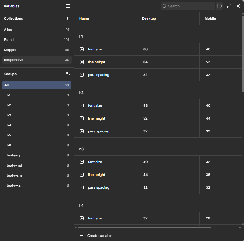
Figma responsive typography variables: h1–h6 and body styles with desktop and mobile font sizes, line heights and paragraph spacing
Type scales carry distinct desktop and mobile values, so a single heading style reflows correctly across breakpoints.
04
Building Blocks

A standard component set.

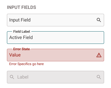
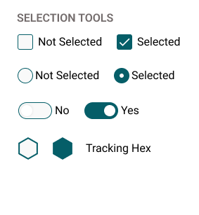
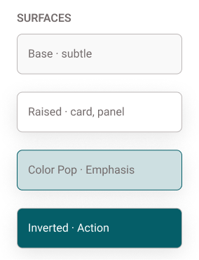
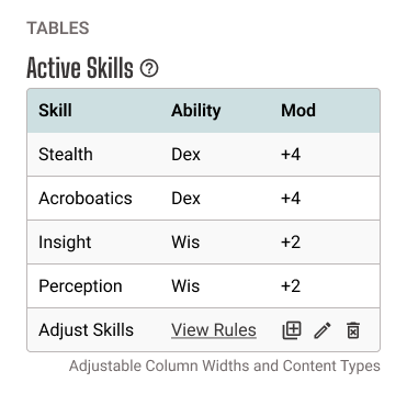
On top of the variables sits the everyday kit every interface needs: buttons, input fields, selection tools, surfaces, tables, and chips, badges & tags.

Each is built with auto layout and wired to mapped tokens, so states and theming come for free. 

The other added benefit is that having all the basics built in a scalable, flexible, and repeatable format means this can be reused for other projects while only having to adjust minor tweaks.

05
Built For The Hobby

Then the product-specific components.

A character sheet is made of dozens of little boxes: ability scores, hit points, death saves, attack cards. Each one became a proper component, built for its exact purpose.

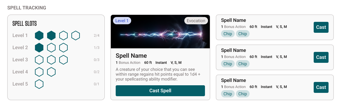
Some demanded input formats you won't find in a generic kit, like the tappable tracking dots players use to count spell slots and resources at a glance.

Stat panels: weight, weapon slots, attack, armor class, constitution and hit points bar
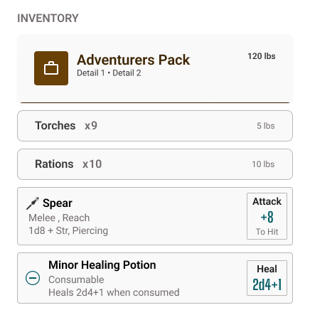
Inventory list with equipped items, quantities, weights and an item detail card
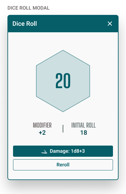
Dice roll modal showing a d20 result of 20, modifier, initial roll and reroll action
Spell tracking: spell slot tracker, a detailed spell card, and a list of castable spells
06
Make It Usable

Documentation for every component.

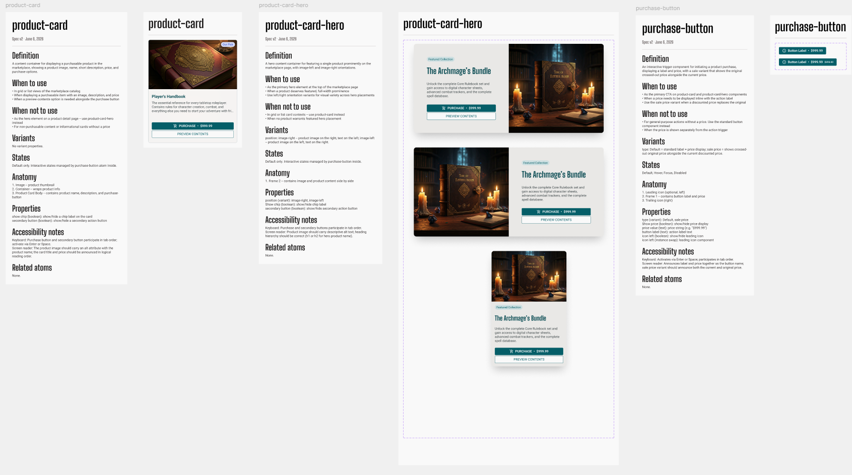
A system nobody understands gets misused. Each component carries a spec: what it's for, when not to use it, its anatomy, properties, states, and accessibility notes.

To make that sustainable, I built a Claude skill, part of my agentic workflows experiments, that reads a component, its properties, and the description I wrote, then lays the whole spec out in a panel beside it. Anything it has to infer gets flagged in the system's warning color for me to review, and it handles updates as the component evolves.

{{ iconFigma }} Open The Design System
{{ iconSpark }} Documented per component
{{ f }}
Auto-generated component documentation panels for product-card, product-card-hero and purchase-button, each listing definition, when to use, when not to use, variants, states, anatomy, properties and accessibility notes
Specs generated beside each component: definition, usage, variants, states, anatomy, properties, and accessibility notes, with inferred details flagged for review.
07
The Payoff

A sample built from the system.

With the system in place, I assembled a full set of sample screens. Unlike the 2021 build, this one supports desktop and mobile, has a cleaner feel, and uses auto layout so spacing stays consistent and adjustments are easy.

Best of all, because it's all wired to the design system, a systemic change ripples through every screen in seconds.

{{ iconPlay }} View The Sample Screens
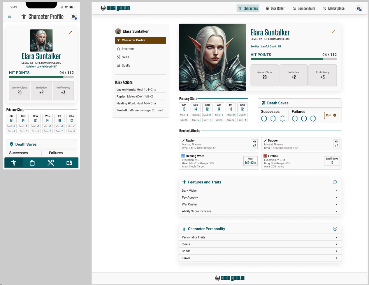
Dice Goblin character profile shown side by side on mobile and desktop, built from the design system
The character profile, responsive: a focused mobile layout (left) and the desktop view (right), from one shared component set.
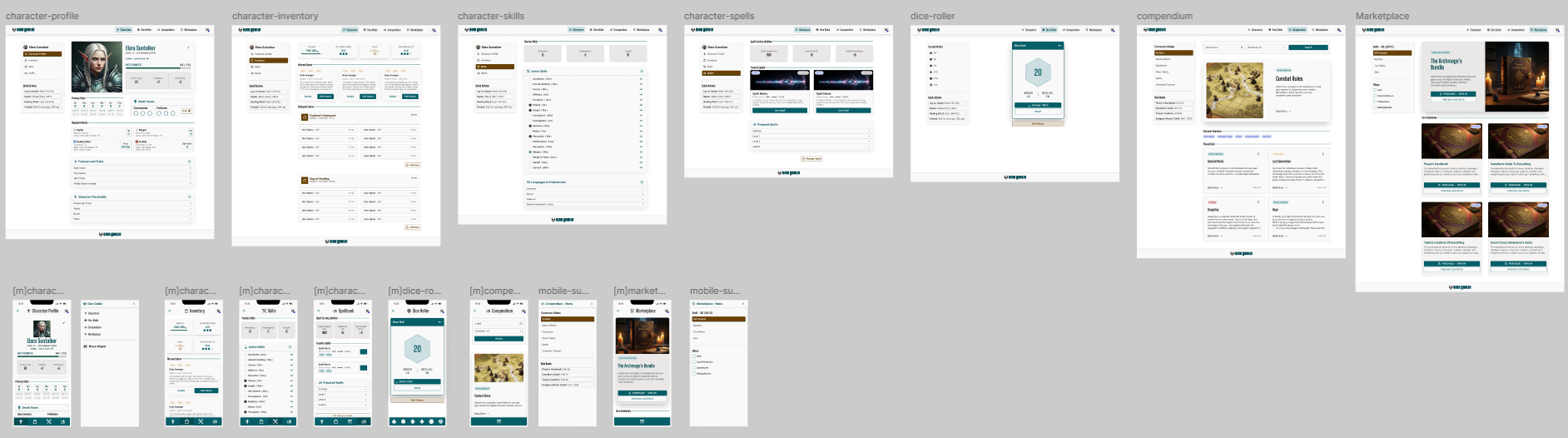
Full set of Dice Goblin sample boards: character profile, inventory, skills, spells, dice roller, compendium and marketplace, each with desktop and mobile variants
The complete sample set: character profile, inventory, skills, spells, dice roller, compendium and marketplace, each delivered for desktop and mobile.
08
A MONTH IN THIRTEEN HOURS

The system is the speed.

The 2021 version took almost a solid month by hand, and any future update would have meant starting that grind over. This 2026 rebuild took thirteen hours total, and the next change to it will take minutes, not weeks.

{{ t.hrs }}h
{{ t.label }}

Five years of running real systems taught me that the craft isn't in placing every pixel; it's in building the structure that places them for you. Dice Goblin was the perfect place to prove it to myself.

Reflection