UI/UX PROJECT SaaS POS

“Cloud POS

A cloud-native point-of-sale platform for the salon & spa industry, designed to free businesses from local databases and make their data agile and secure.

“Cloud POS” was the working title while in development: a modern, slimmed-down release planned to grow into the full feature set of our existing platform, rebuilt responsive, touch-first, and ready for any device on the floor.
Role
UX / UI Designer
Type
SaaS POS Platform
Industry
Salon & Spa
Tools
Sketch · Adobe CS · inVision
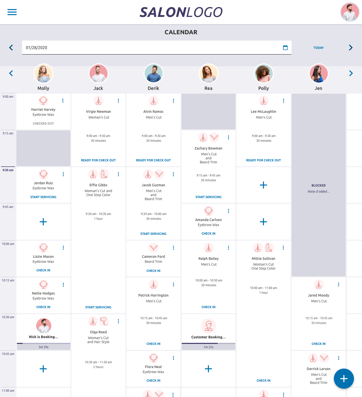
The booking calendar, the heart of the platform.
02
The Brief

A point of sale, lifted to the cloud

The goal was to replace heavy on-site databases with a cloud-native platform, one that kept salons agile, kept their data safer, and could be picked up on a desktop, a tablet, or a touch terminal without missing a beat.

Cloud-native
No local databases to maintain. Data lives in the cloud, accessible from anywhere.
Agile business
Owners can move faster, scale across locations, and adapt without an IT project.
Secure data
Centralized, backed-up records, far more resilient than a machine in the back office.
Modular by design
Ship slim, then grow into the full feature set, so owners enable only what they need.

Launch modern and slimmed-down, then grow into everything the current platform can do, without ever asking a salon to babysit a server.
03
The Heart of It

A booking calendar built for the floor

The calendar is where a salon lives all day, so it had to feel effortless. A modern, fully responsive design with a per-stylist column view, color-coded service icons, and clear check-in / check-out states at a glance.

Designed touch-first for terminals and tablets, with drag-and-drop rescheduling planned so the front desk could move an appointment with a single gesture.

Touch-optimized
Drag to reschedule
Cloud POS booking calendar with per-stylist columns
Per-stylist columns, time rail, and live appointment states across the day.
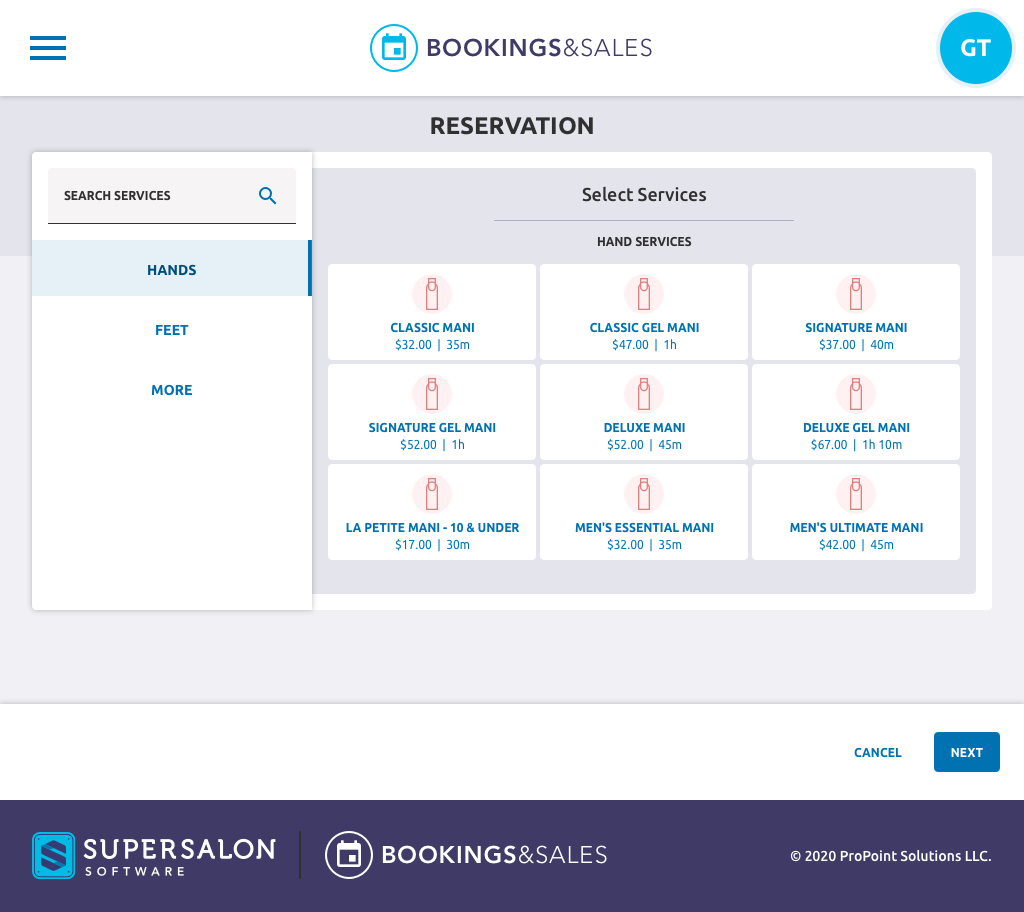
Select services by category screen
Service selection is grouped by category with price and duration up front.
04
Know the Guest

Thorough guest details, kept modular

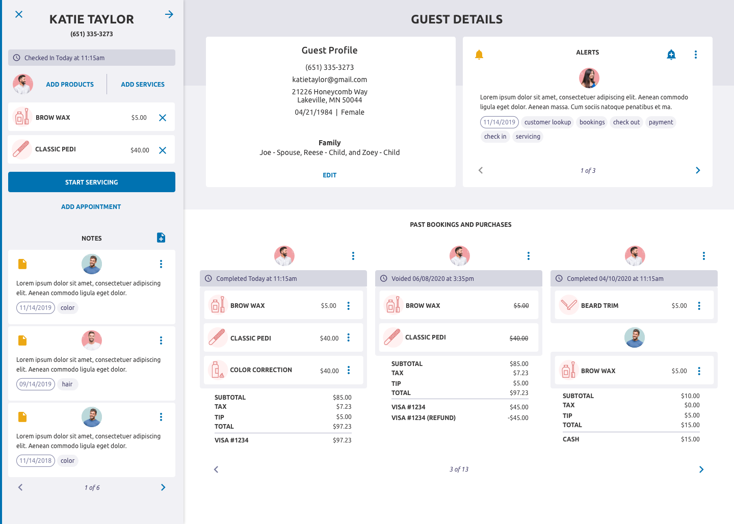
In the salon industry, knowing your guest is everything: contact, family, preferences, history, and alerts. The platform planned for expansive guest records, but kept every field modular so owners could turn on only the data their operation actually needs.

From a clean add-customer form to a full profile with past bookings, purchases, notes, and staff alerts, and a fast checkout that pulls it all together.

Guest details screen with profile, alerts, and past bookings
The full guest record: profile, rotating staff alerts, and past bookings & purchases in one view.
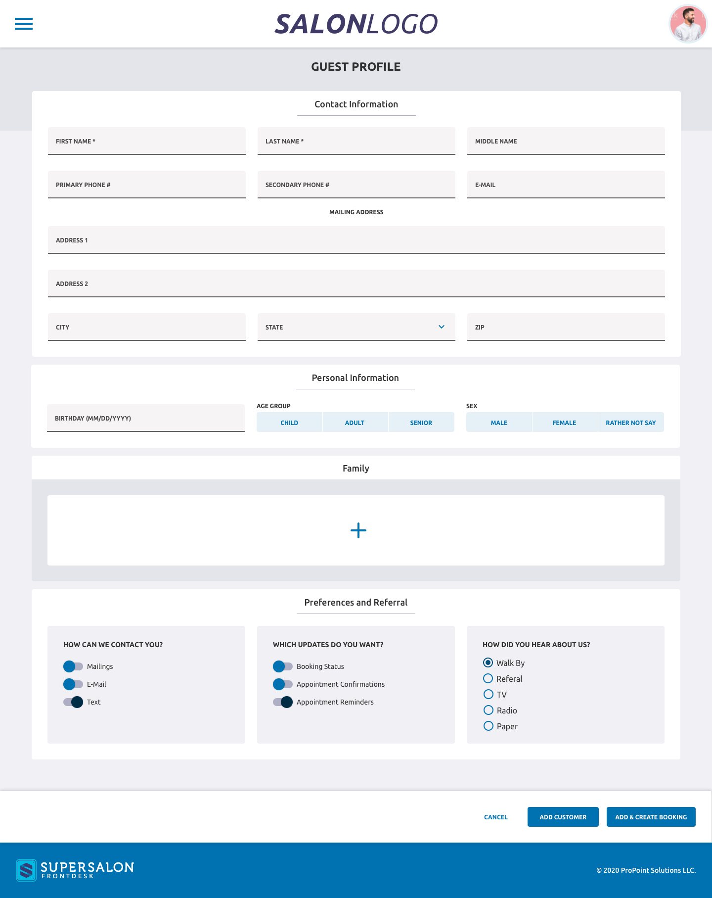
Add customer guest profile form
The add-customer form: contact, mailing, personal, family, and referral, with modular sections throughout.
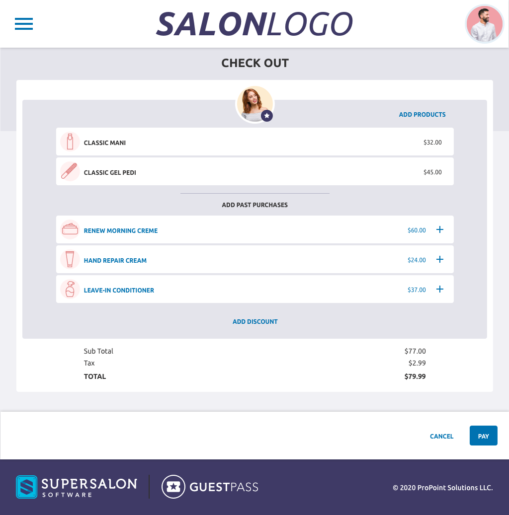
Checkout screen with services, products, and totals
Checkout surfaces services, suggested products, and a running total before you take payment.
05
Map Before Build

A flow for every action

Before any screen was finalized, we drew up user flows for every action a user could take. It kept the whole team clear on what happens when, and guaranteed there were no dead-ends, that every piece of data could be created, edited, or removed.

Booking flows also had to adapt to the type and size of the business: a walk-in shop, a salon, and a full-service spa each have very different needs.
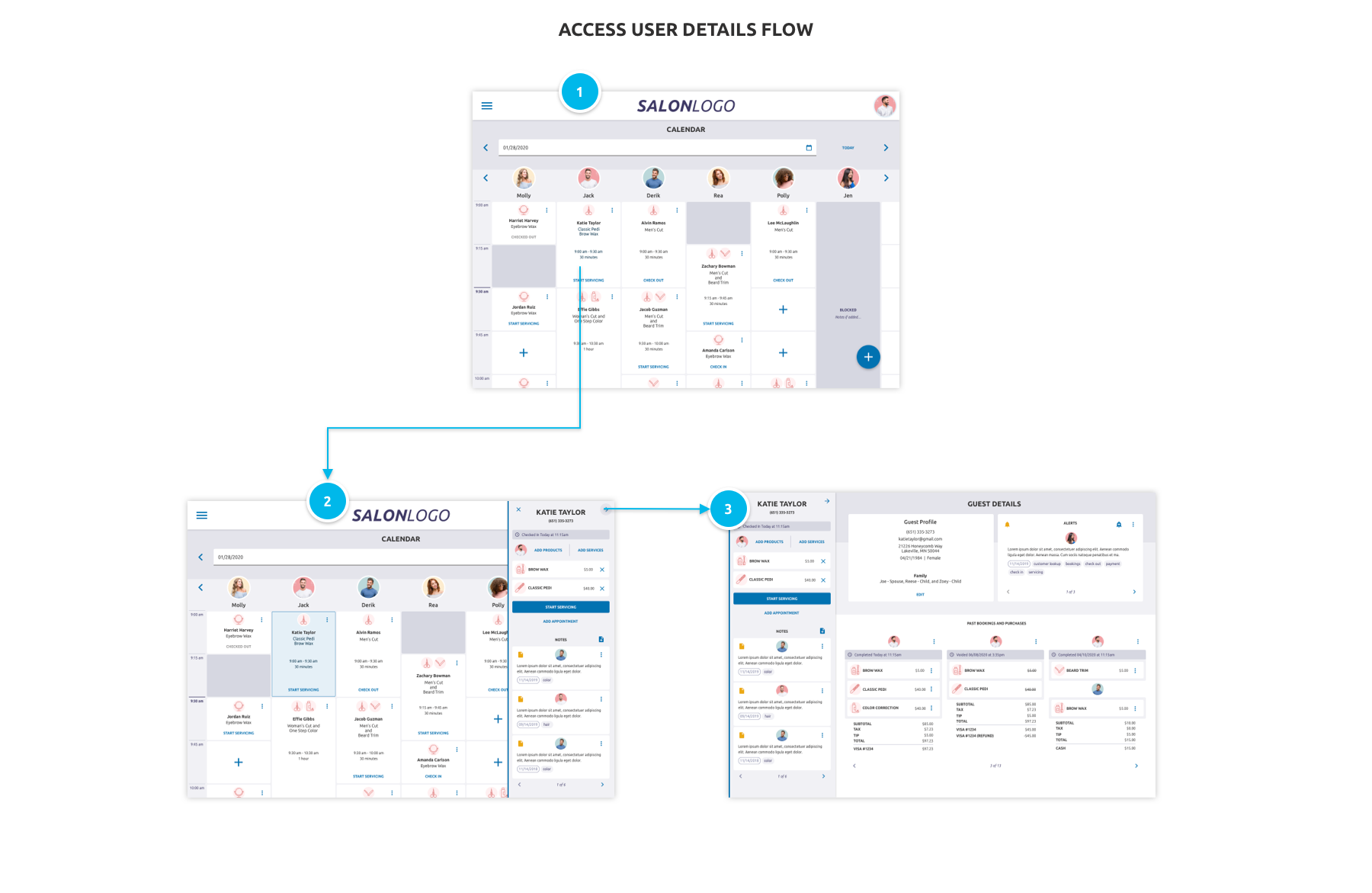
Access user details flow: calendar to side panel to guest details
The “Access User Details” flow, from a calendar tap, to the servicing side panel, to the full guest record.
Walk-in shop
Fast, queue-first booking. Get a guest into a chair with the fewest taps possible.
Salon
Appointment-led scheduling across stylists, with service and product attach at checkout.
Full-service spa
Multi-service, multi-room visits with packages, resources, and longer guest journeys.
06
The Big Picture

One platform, the right door for each role

Owners didn’t want every function and every figure exposed to every employee on the front end. So sensitive data and top-down controls lived in a separate, planned back end that emulated the existing one, but with higher-level organization, an improved design, and more task-focused sections.

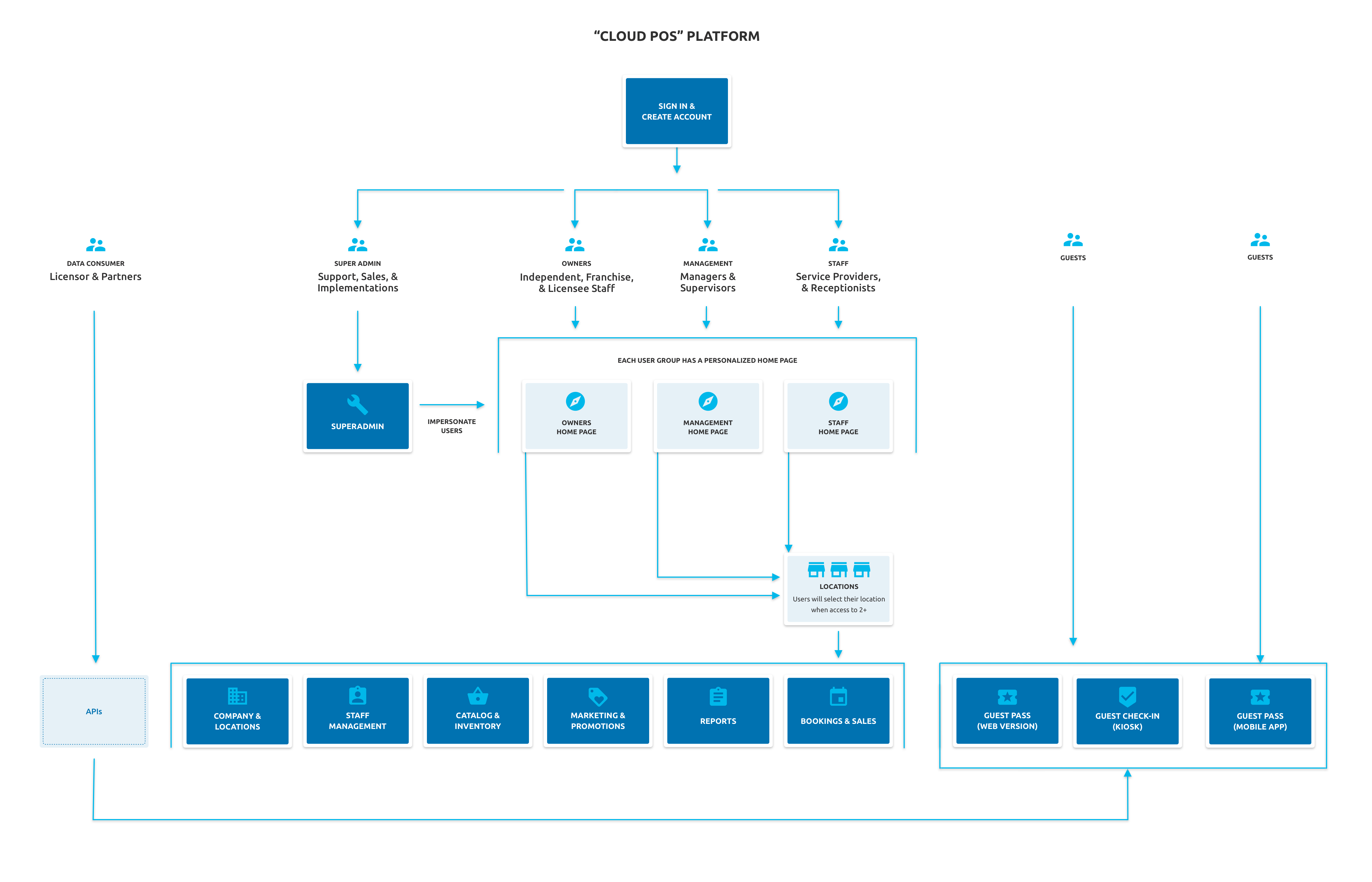
The platform map below shows how each user group, from super admins and owners to management, staff, and guests, gets a personalized home and a tailored set of tools, all backed by long-standing customer feedback.
A personalized home per user group
Owners, management, and staff each land on a home built for what they do.
A separate, secure back end
Sensitive data and top-down controls kept off the floor and out of plain sight.
Guest pass, kiosk & mobile
Web, kiosk check-in, and a mobile app give guests their own front door.
Cloud POS platform sitemap showing user groups, home pages, and modules
The full platform map, from sign-in and role routing through every module and guest touchpoint.
07
The Companion App

Guest Pass, guest check in made easy

Where the platform served the floor, Guest Pass served the guest. It was the customer-facing companion to “Cloud POS” (and the existing Super Salon platform). It was a self check-in app that put booking and discovery directly in the guest’s hands.

Guests could find locations near them, schedule a visit at the time and with the employee of their choosing, manage their bookings, tag their favorite salons, and pull up directions, all from their phone. Designed as both a responsive web app and a native mobile mirror, in Sketch, inVision, and Material UI.

Find & favorite locations
Book your time & stylist
White-labeled per brand
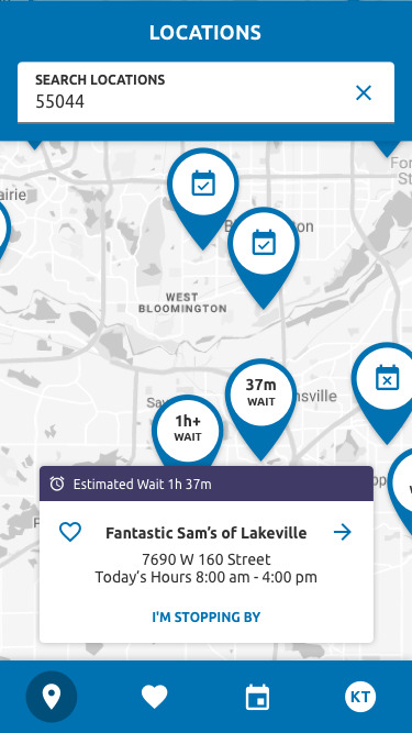
Guest Pass locations screen with nearby salons, live wait times, and a location card
Nearby locations with live wait times, hours, and a one-tap “I’m stopping by.”
One Codebase, Every Brand

Built to wear the client’s brand

Branding was baked in from the start. If you’re a Fantastic Sams, it should look like a Fantastic Sams app, Supercuts would look like Supercuts, and a guest who opens it should never see a competitor’s locations. The point was to keep each brand’s customers inside their own ecosystem.

Clients sent a short list of design collateral; that copy of the codebase shipped to the app stores under their name, logos, and colors. On the back end, the API recognized which brand was calling and filtered every result to match.
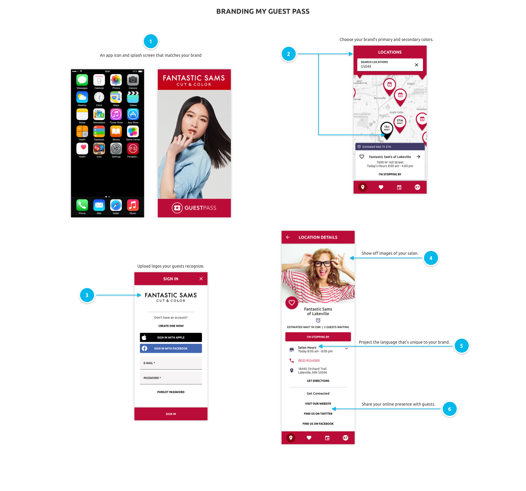
Branding My Guest Pass: app icon and splash, brand colors on the locations map, recognizable logos on sign-in, salon imagery and brand language on location details
The branding playbook handed to each client, from app icon and splash to primary colors, recognizable logos, salon imagery, and the language unique to their brand.
A note on what happened

Neither Guest Pass nor “Cloud POS” ever made it to launch. The company folded before the apps could ship, so what you see here is the work as it stood, designed, mapped, and ready for the app stores, but was only ever used in a couple dozen test stores.

08
Looking Back

Reflection

Designing “Cloud POS” was an exercise in restraint: ship something modern and slim, but architect it so it could grow into a full platform without a rebuild. Mapping every flow first, and keeping guest data modular, is what made that possible.

Responsive & touch-first
One design system, desktop to terminal to tablet.
Modular & scalable
Slim at launch, room to grow into the full suite.

A point of sale is only as good as the calendar the team trusts and the guest record behind it. Get those two right, and everything else has somewhere to grow.

Built modern, planned modular, and mapped end-to-end before a single screen shipped.